WHERE BRILLIANT THINGS HAPPEN.
BRILLIANT CITIES.
WHAT WE DID TOGETHER
Brand Architecture
Brand strategy
Brand voice
Messaging and copywriting
Brand identity and design guidelines
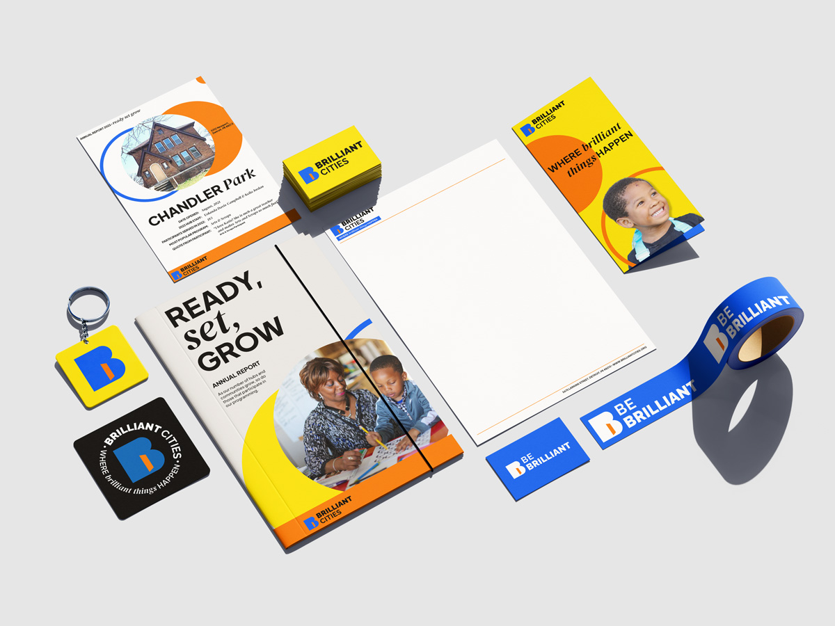
Brand application and materials
Social media assets
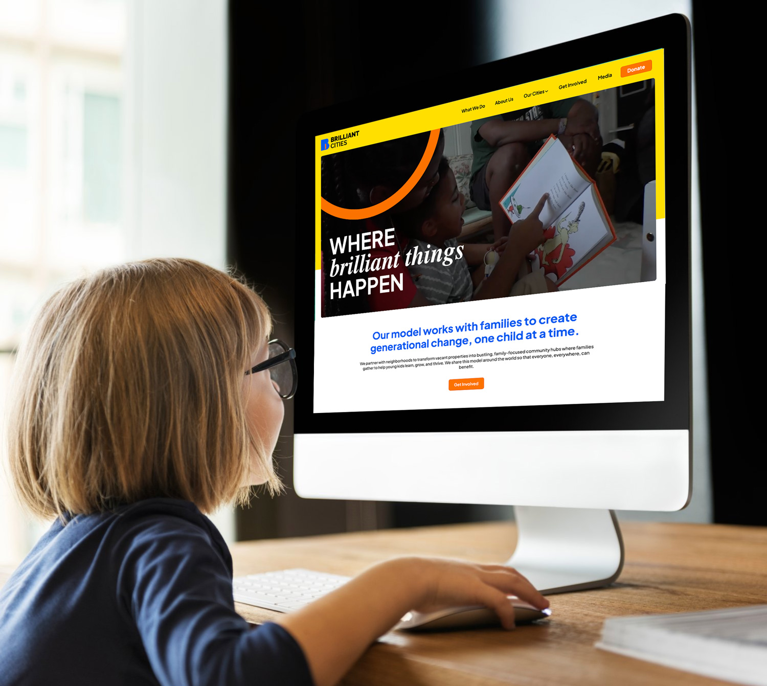
Website
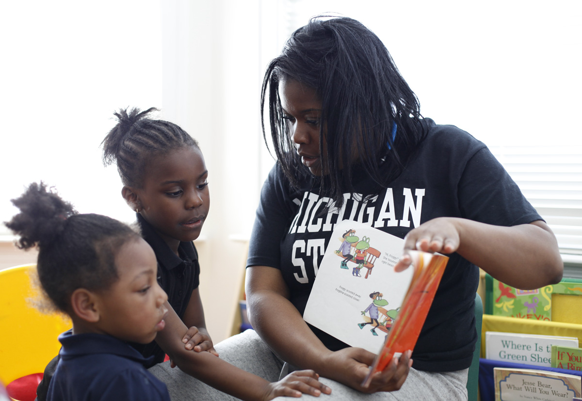
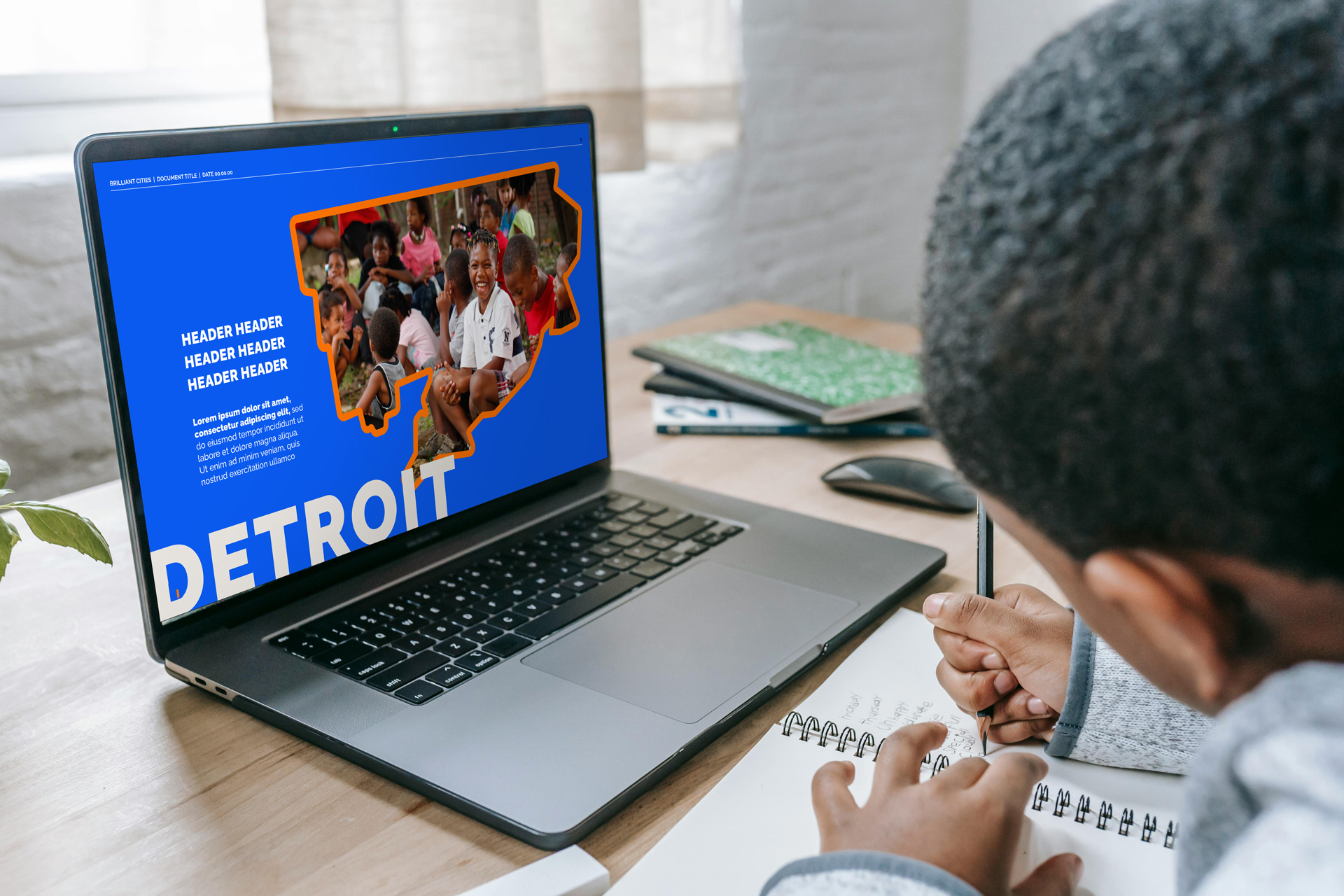
Brilliant Cities create places where brilliant things happen. This new organisation is the national and global expansion of Brilliant Detroit. It is a neighbourhood-powered model ensuring children 0-8 are school-ready, healthy, and supported. They do this by transforming houses into community hubs where children and families have what they need to thrive.
It’s scaleable, transferable and hyper-local – and it’s working!
Together with the Co-Founder Cindy Eggleton and her leadership team, we transformed Brilliant Detroit into a joyful, powerful and effective platform to take their work to the international stage – greater reach, greater impact and greater societal change. A combination of brand architecture, strategy and identity design was brought together to honour their work to date and reimagine their brand for the future.
THE CHALLENGE:
Legacy, Reimagined for Scale
The legacy of Brilliant Detroit precedes them across this resilient city – their success and expansion has been fast and great. Our challenge was how to build a global-facing brand that can bridge the hyper-local, grass-roots approach that made them who they are, with the scalable, societal change and community building impact that their model brings.
This shift in brand meaning and positioning opens up new audiences and conversations that went beyond where they currently operated on the ground in their city. This was about dreaming BIG, building to what was possible on a global scale. Where the brand was wasn’t telling this bigger vision and story. We wanted Brilliant Cities to launch with a credible, comprehensive identity and message from day one – an evolution that allowed loyal advocates to share in their growth and continue to feel part of the story.
The Research:
Real Stories of Connection
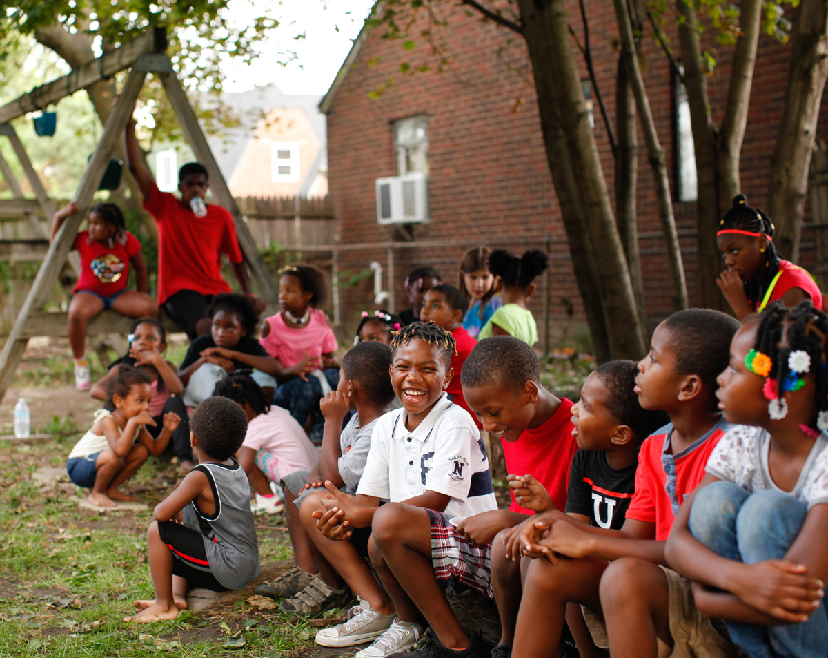
The research process was comprehensive – we spoke to board members, team leaders and staff, also partners, allies and aligned organisations that champion their work. This allowed us to get a full picture of how they operated and what it meant to those involved.
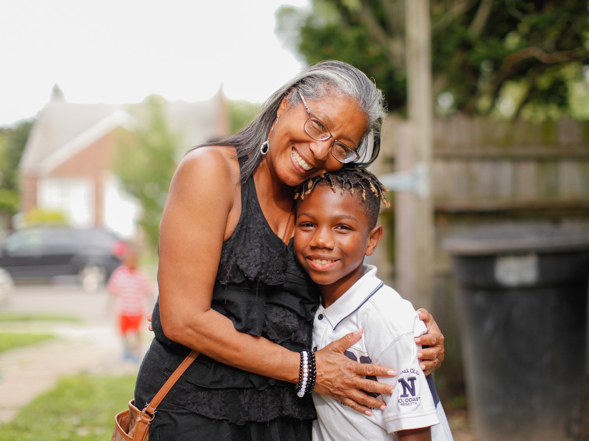
Cindy Eggleton, the Co-Founder, herself is the embodiment of love, warmth and connection. She loves her people and her city. Everyone connected to Brilliant Cities/Brilliant Detroit was compassionate, driven and hopeful about their work and its impact. The culture this organisation has built over their 8 years shone through with every interaction. We wanted to capture this and bottle it up! We knew that this care is what made the brand unique.
“This was a joy at every point, this project – the team, the work, the concept. This was about elevating and amplifying what’s already been, inviting them to build their big dream and create a brand to hold it. It was so hopeful, fun and positive – infectious!”
Lauren Jones, Brand by Boudica
THE STRATEGY:
Grass-Roots At Its Core, With Global Potential
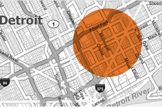
The significant shift in the brand’s strategic position was from pure service-provider and curator working at grass-roots level to a global model that can be adopted by other cities. This elevated position required architecting the organisation’s structure, ownership and model, and shifting the story to one of broader impact outside of Detroit (whilst being proud born out of Detroit I hasten to add!). They had already had a lot of interest and gained serious momentum that this rebrand came at the perfect time to meet the needs expressed by other cities across North America.
This also saw us coaching the leadership through owning their true impact and potential – to step into it and capture the essence of what started it all, how it can be taken to bigger stages. Everytime, the story was grounded in community and place. This was the balance and challenge we had to solve for.
“This has truly been the greatest consulting experience we’ve had (in my opinion).
The Boudica team “got it” and was a trustworthy stewards of our brand from the beginning. You captured things that we ourselves could not hope to and that is the mark of a true consulting organization.
Anytime in the future that we are given the opportunity to work with Brand By Boudica, Brilliant Cities will take it. This has been an unparalleled experience.”
Aaron Appel, Director of Strategic Growth, Brilliant Cities
The STORY:
A Place Where Brilliant Things Happen
The combination of the ‘how’: community-first, family-focused, elevating child learning; the ‘what’; a proven model that is scalable and transferrable, meant we started the conversation in the heart of the community – about place and space for learning, safety, love and growth. We put the people, the neighbourhood at the core of the brand – each as individual as the next. We needed to create something that spoke to the idea of place, inclusion, community and wholeness. And all from behind an orange door! It’s their signature – each hub has its door painted orange so the community knows where they can come and be heard, supported and resourced.
Our goal was to tell the power of this narrative and impact. In doing so, create a brand that balanced optimism and effectiveness whilst honouring what’s been.
THE IDENTITY:
Love + Safety + Growth = Brilliant
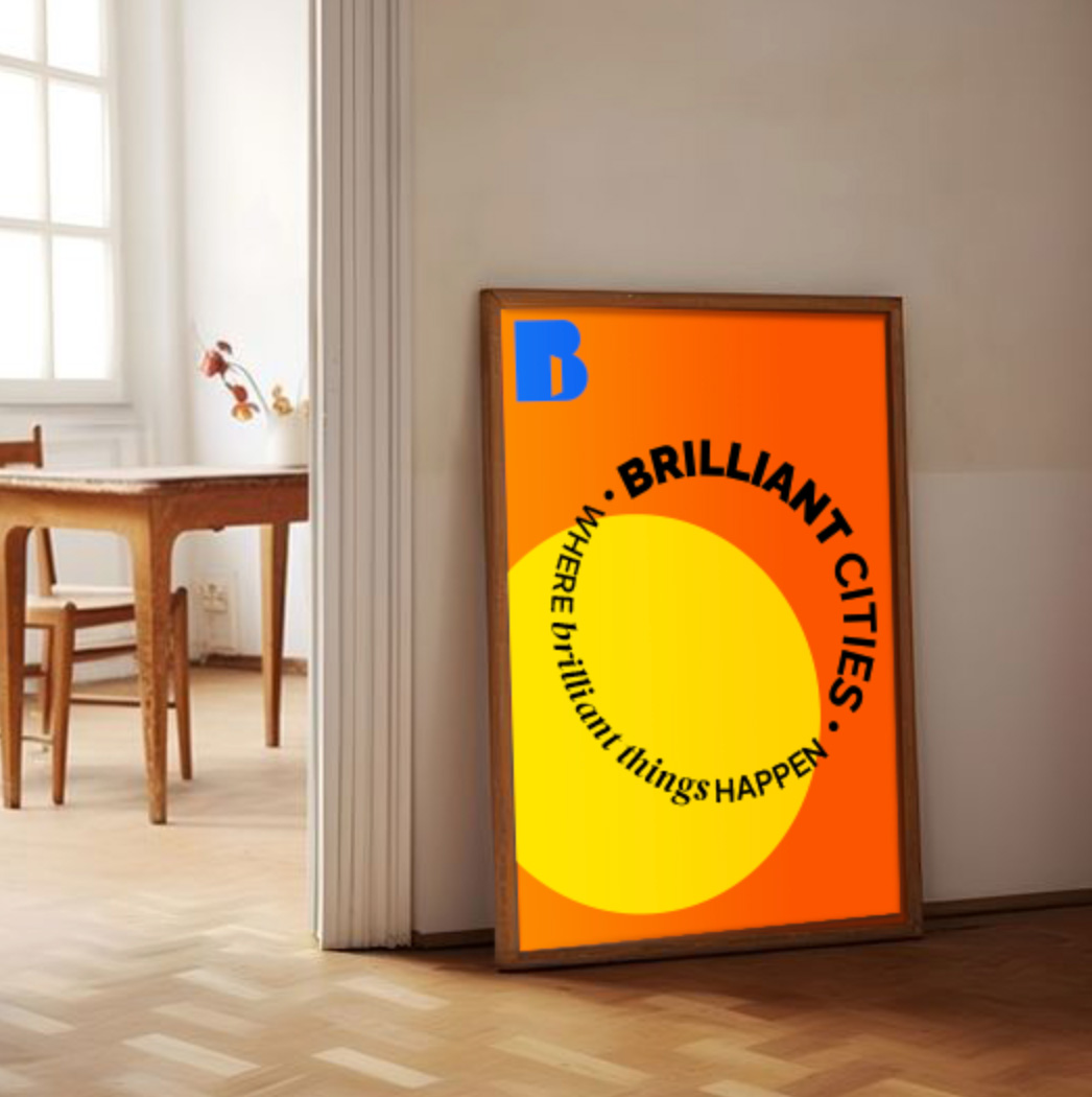
From the beginning, we wanted the Brilliant Cities brand to be vibrant, joyful and accessible. A visual identity that could reflect their communities and work whilst being bold and unignorable, so when it was brought to the attention of other city and community leaders, they were left feeling inspired, wanting to know more.
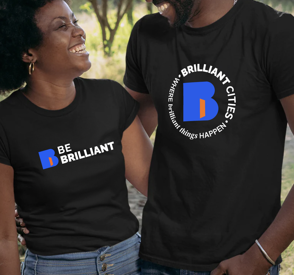
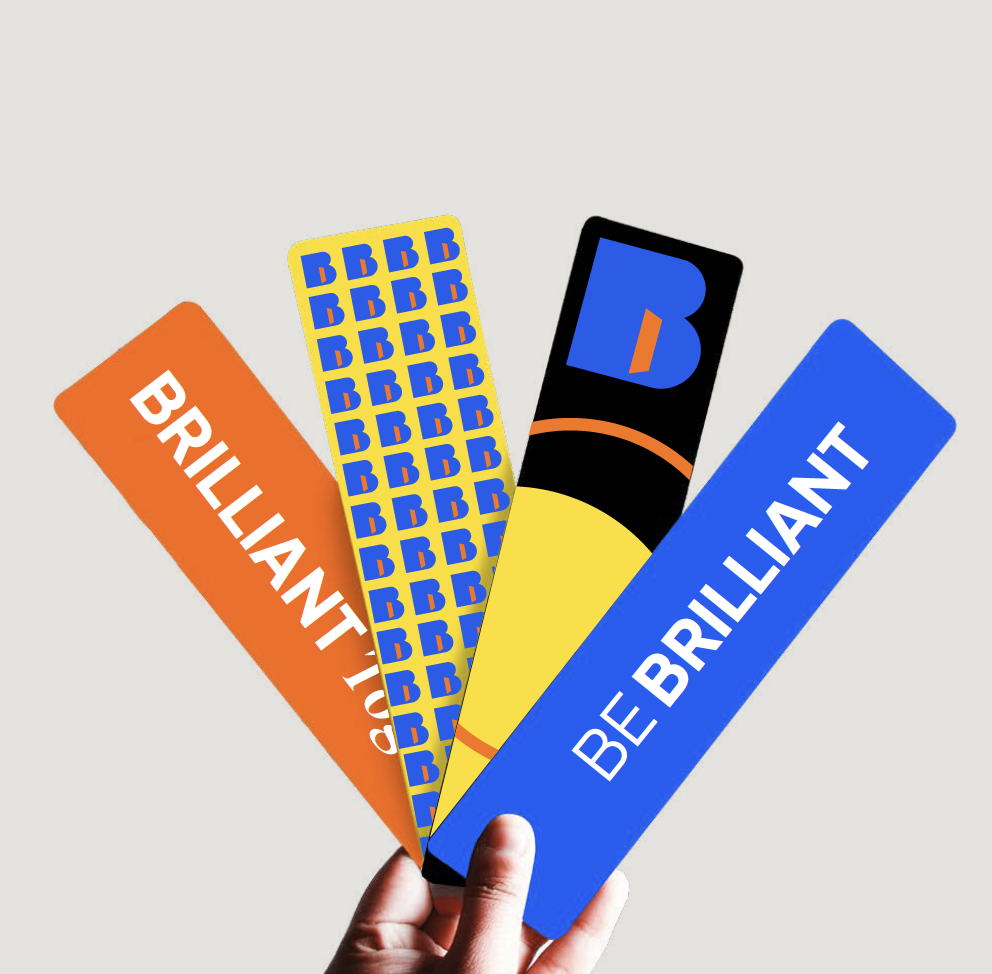
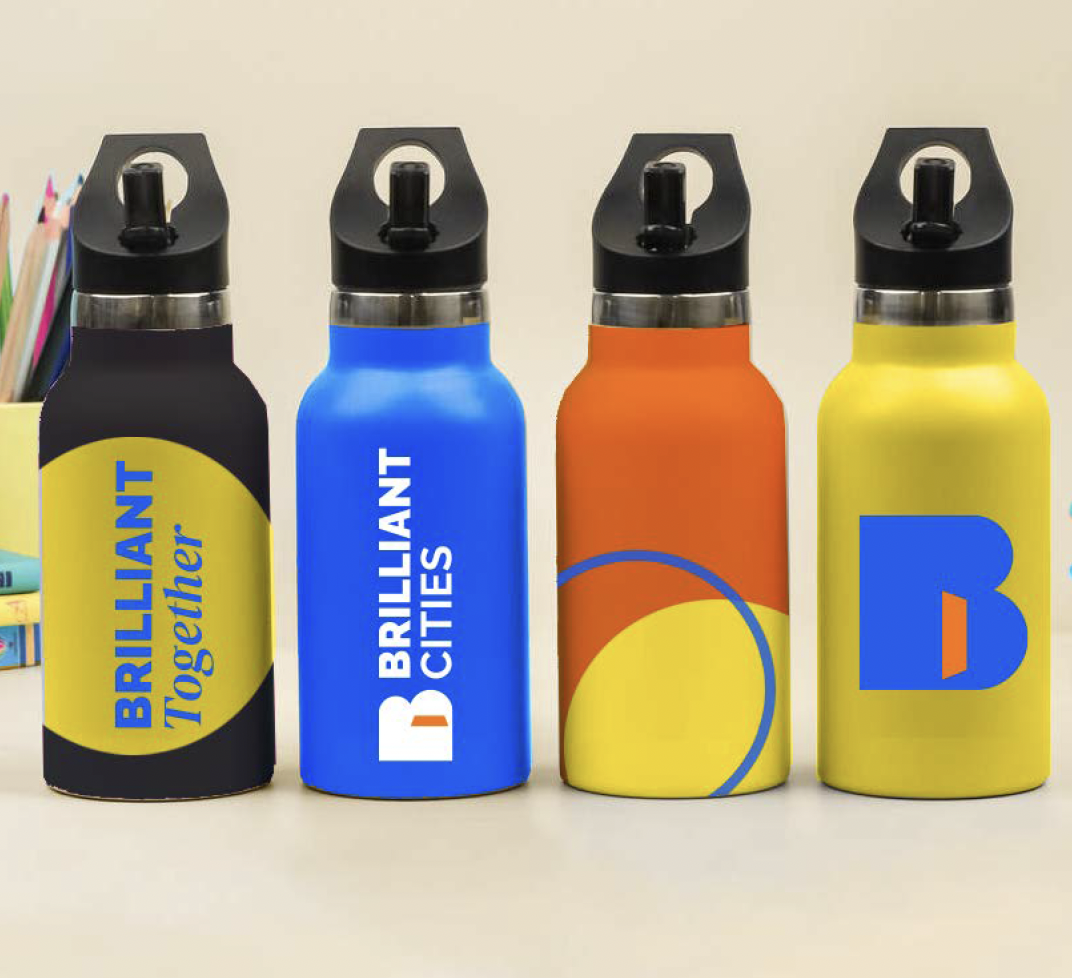
The existing palette was tweaked: the orange more vibrant, the blue more saturated and introducing a sunny yellow. The fonts were kept simple, rounded and friendly. The circles became the mechanic to hold imagery, messaging, denote a place, highlight people or a moment. They can be used in a myriad of combinations and colours, to reflect the diversity of each neighbourhood.
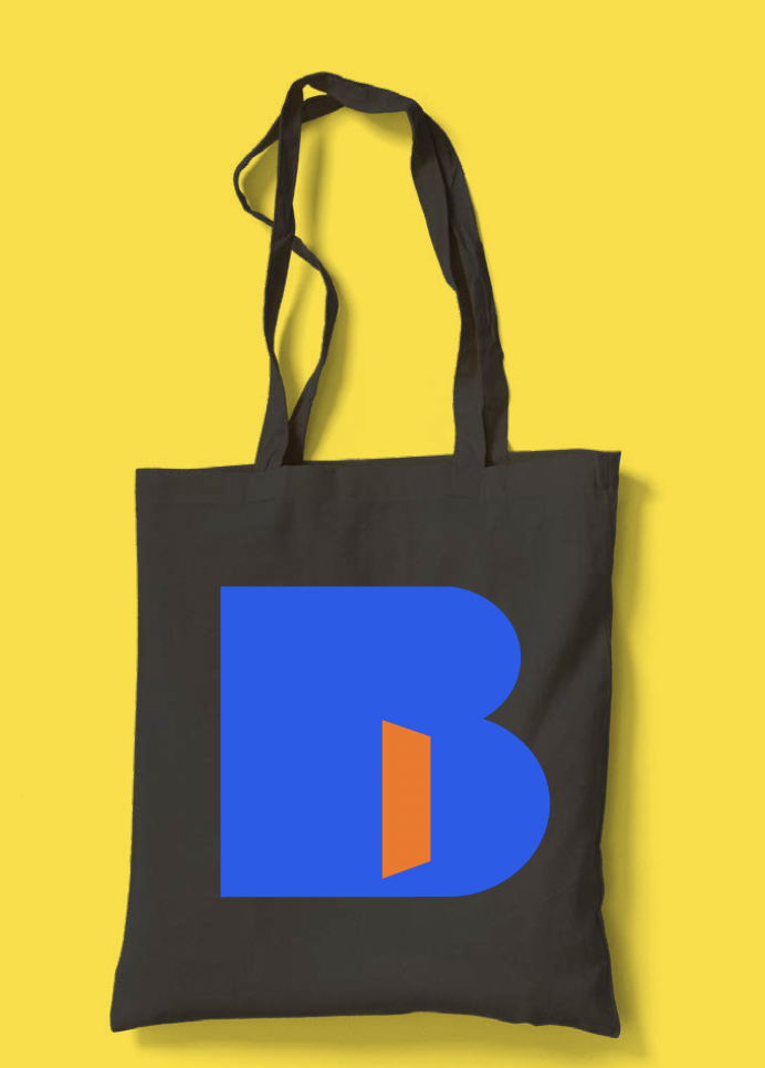
The icon – a bold B contains an open orange door – the symbol of the hub and ethos of the organisation. It’s an invitation to come in and take a seat, connect with people in your neighbourhood and get supported.
Each city has its own, unique font (Brilliant Detroit, Brilliant Philadelphia, Brilliant Cleveland etc), so they can have their own sub identity. This was important as each execution of the model will vary from city to city and we wanted to offer a little something different for each one.
The impact:
Launch to International Adoption
The brand launched with much anticipation and a warm welcome. There is a growing waitlist of cities to adopt the Brilliant Cities model and discussions for further expansion, internationally, are ongoing.
The project has given a greater depth of understanding both internally and with their audiences, that has set them up for future growth in a while new way.

“There’s almost no words for the transformation.”
Cindy Eggleton, Co-Founder, Brilliant Cities