Innovative stories in motion.
FOUR FRIENDS
FOUNDATION
WHAT WE DID TOGETHER
Brand strategy
Brand voice
Messaging and copywriting
Brand identity and design guidelines
Brand guidelines
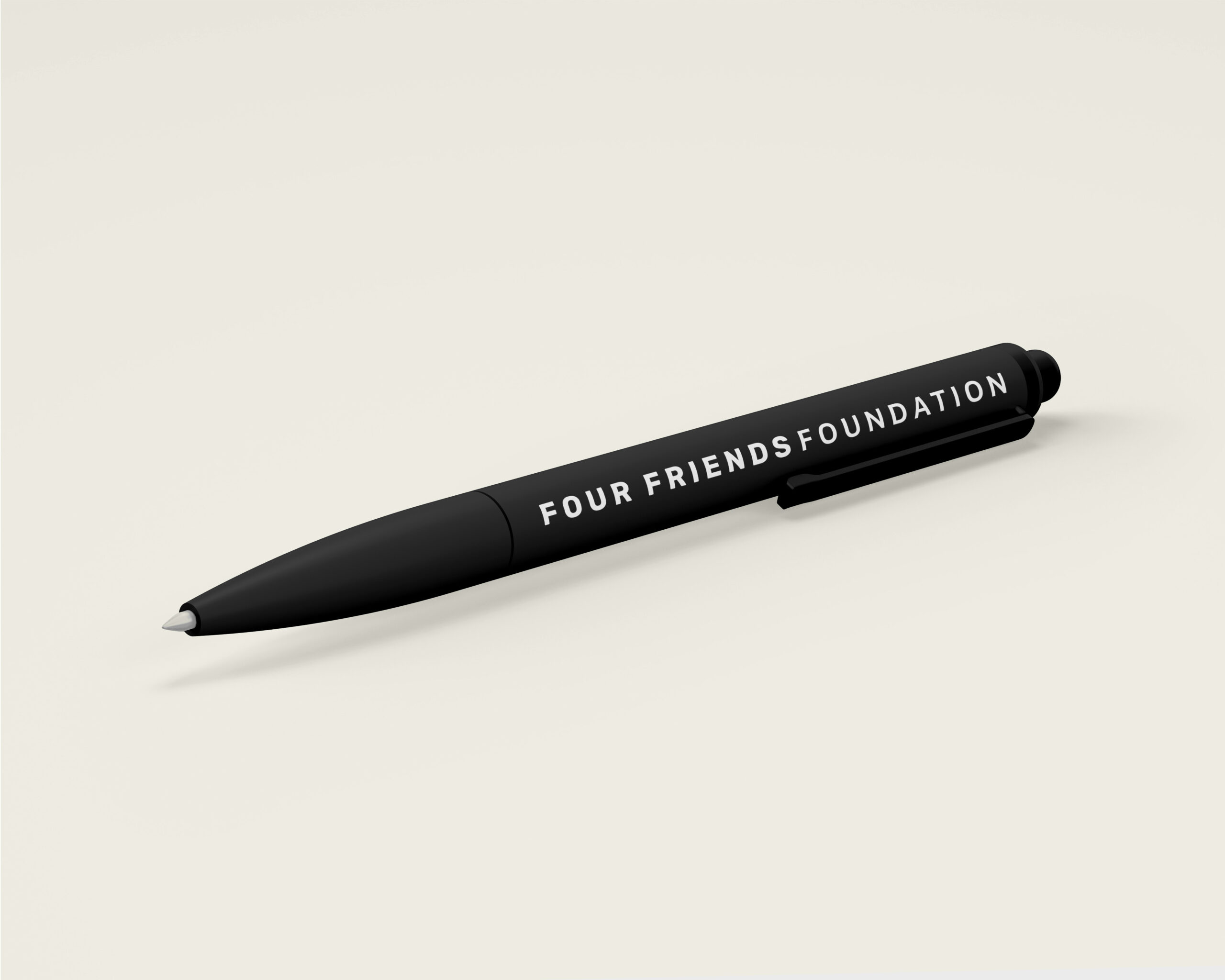
Brand application and materials
Brand consultancy
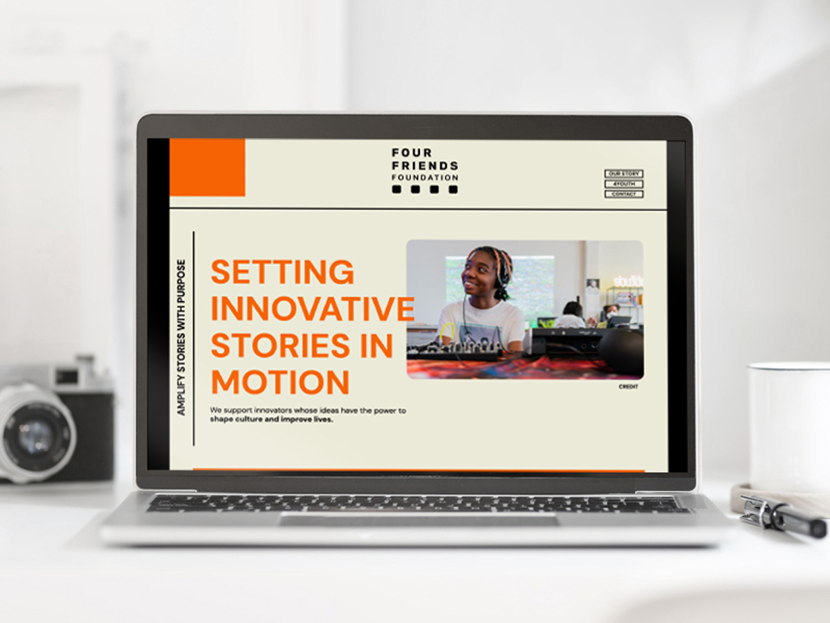
Website design and build
Founded by Bob Shaye (studio entrepreneur behind some of the greats like Nightmare on Elm Street, Lord of the Rings and Austin Powers) – his knack for spotting vital stories and gifted storytellers mixed with a passion for unearthing the unconventional continues with his foundation.
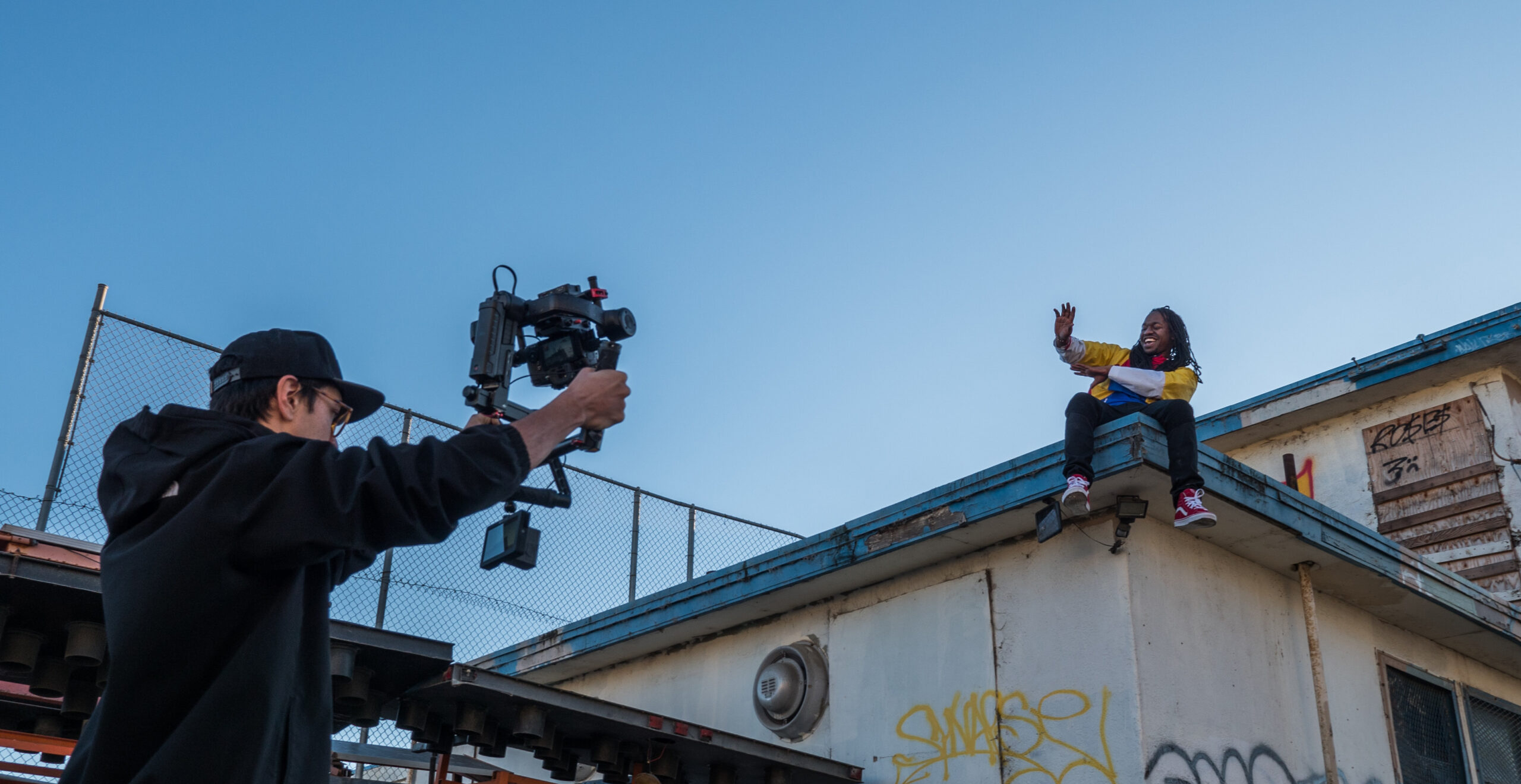
They aim to amplify influential and often underrepresented voices that have the power to reshape our cultural landscape.
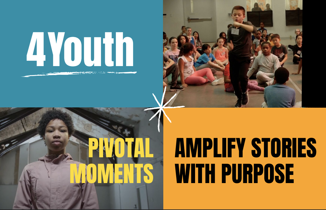
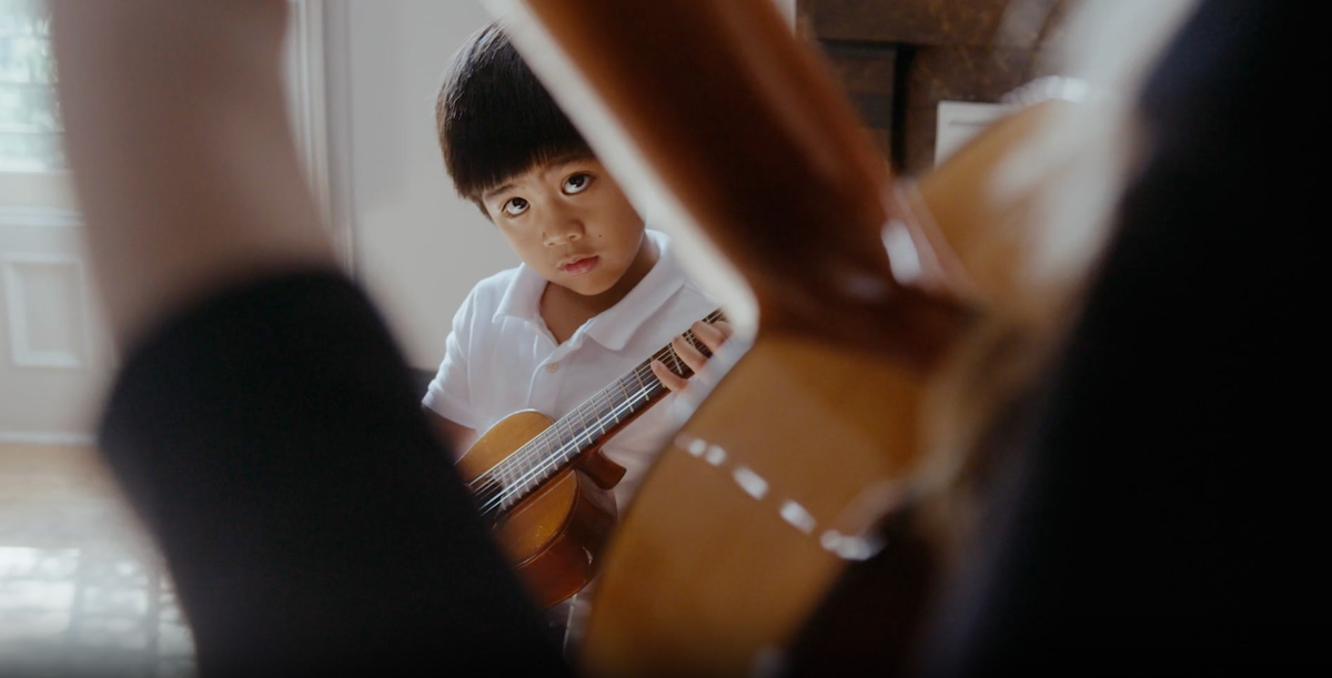
Their lead grant programme, 4Youth, supports creative youth development organisations that unlock the potential of young people by spotlighting their stories.
We embarked on a true collaboration, with Bob’s daughter, Katja, to create the brand story, strategy, identity and messaging for both the foundation and programme.

THE CHALLENGE:
Honouring big screen legacy, and beyond
Bob’s career is well-documented and revered, spanning decades with a long list of successful, oftentimes offbeat titles that were often underestimated by others. His ability to see the potential of ideas and ignite audiences is second to none.
Building a foundation’s brand is true to this history and ethos, whilst being future-facing and aligned with a vision of accessible creative expression for all, was a challenge.
We had to find a unifying narrative to meet the needs of the founder, stakeholders and beneficiaries – it took a lot of digging, expansive thinking and in-the-weeds brainstorming. How can the story continue to be the star?
“ Thank you for getting us to this spot — it feels much better introducing ourselves to the larger ecosystem with such strong materials!”
Katja Shaye, Executive Director.

The Research:
Our own cinerama – the fullER, bigGER picture
To understand the foundation, we interviewed a number of close associates – grantees, advisors, partners, family members, Katja and, of course, Bob.
The through line of this brand’s own story, emotionality and universality at the core of the stories Bob sought to bring to the big screen. This became the nugget for expressing the bigger picture – the cinerama – of the foundation.
“This was such a fascinating exploration into what makes a great story and how this foundation supports innovative stories, ideas and how they can truly come from anywhere. Their exacting nature, fastidious at times, to unearth that underrepresented tale, that nugget of a golden idea that’s been hidden and amplify voices previously hushed, is extraordinary. It’s an art, and to pull that into an articulate, concise narrative and identity was a real challenge… We loved every minute..”
Lauren Jones, Brand by Boudica
THE ETHOS:
GOOD IDEAS COME FROM EVERYWHERE
This key differentiator spoke to their ethos, their behind-the-scenes nature and humility of the brand, the family and the foundation. This brand was not about the benefactors, but creative youth development arts nonprofit organizations they were supporting, highlighting the brilliance of the students they serve.
THE HOOK:
CREATIVITY UNLOCKS POTENTIAL
Four Friends sees creativity as the gateway to untapped potential, to opportunities and as a solution to so many issues around community, communication, connection, expression, self-awareness, empathy, diversity… the list goes on. This was the hook for their messaging and positioning.
The OFFER:
Programming 4Youth
Two things became apparent early on: Some initiatives within the organisation had gained momentum and clarity about what they were doing and for whom; and other initiatives didn’t sit directly with this programme.
Thus, we had to take a step back and architect the brand offerings and positioning.
It was then clear that their first ‘signature’ programme was already in the works and warranted its own identity. 4Youth was born!
THE IDENTITY:
The Story is the Star
This brand really needed to take a back seat, letting the beneficiaries and the stories be the star. We worked with an existing palette and reworked it into a new modern, grounded and pared-back aesthetic, drawing on Katja’s Scandi heritage too.
We kept things very simple with a tight palette, one font family and a subtle nod to film with the sprocket mechanism. We wanted everything to feel intentional, subtle and powerful.
“The logo is bold, simple and I think, provokes curiosity. Just perfect!”
Katja Shaye, Executive Director.
The impact:
A brand ready to spotlight others
Every word and design element was tested, played with and edited. This was about exquisite execution.
The result is a masterfully simple communications package, tight messaging, confident positioning with a design aesthetic that allows ideas and stories to shine through.
The collaborative nature of this project surpassed anything we’ve done before. This is an exciting, quietly confident brand that will have its own big impact, spotlighting and celebrating amazing organisations and the creativity of young people.

Katja Shaye
Executive Director, Four Friends Foundation
“The brand has made a huge difference for us. We can present ourselves with a level of confidence that wasn’t possible before. And now, we don’t have to solely explain our foundation’s mission through conversations.
What surprised me to most was what a bonding experience it was and how we were able to codify what the foundation is today while making room for its future incarnations.
We are deeply grateful for your wonderful work with us!”