Complex. Genuine. Curious.
RUTH
FOUNDATION
FOR THE ARTS
WHAT WE DID TOGETHER
Brand consultancy
Brand strategy
Brand voice
Messaging and copywriting
Brand identity and design guidelines
Brand guidelines
Brand application and materials
Social media assets and campaigns
The Ruth Foundation of the Arts embraces the way of the artists in every aspect of their work.
Their mission is to explore new possibilities for arts philanthropy through an artist-driven approach—championing this through grants, initiatives, and conversations that support creative expressions and activities in unexpected places.
We set out on a collaboration to establish their brand strategy, craft a brand experience that aligns with their vision, and tell their story to the world.
THE CHALLENGE:
National Presence, Local Activation
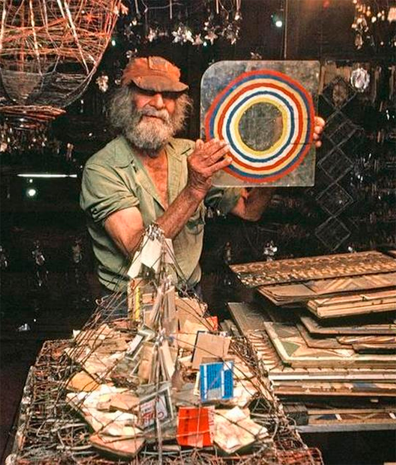
Ruth DeYoung Kohler II (1941-2020) was always an advocate for artists. When she passed away, she left her passion to promote inclusive access to the arts, putting the individual needs of artists and the collective needs of communities above all else, into her wishes for her foundation.
With this vision in mind, the team came to us to figure out the brand foundations they needed to have conversations at a national level while impacting the art world and communities hyper locally. How can they have the prominence they deserve as a foundation but still be accessible at the ground level?
“Ruth was good at not doing what people expected of her and of art. We’re not about TRANSFORMATION but RESPONDING to communities.”
Karen Patterson, Executive Director.
The Research:
Getting the full picture of Ruth
At the core of the foundation lies Ruth DeYoung Kohler II’s legacy, personality, and impact of her generosity.
With that in mind, we conducted a number of interviews from her closest circle – family members, best friends, lawyers, staff and board of trustees at the foundation.
They shared their memories, favourite and funny stories of their time together, what Ruth meant to them, and what made Ruth who she was.
The way Ruth would show up and do big speeches, AND enjoy quiet and special moments with her dad on long car journeys. How she could own a room or stage, AND be intensely private and humble. How she could make a big impact, AND connect personally with her local community.
It was these stories that led us to the overarching strategy of The Ruth Foundation of the Arts: The Original Paradox.
“Spending time with people who knew her showed us the full picture that was Ruth, we felt we knew her by the end of the intakes!
We heard such an array of moments and memories that showed us she was this AND that, she meant different things to all these people and those qualities were all Ruth.
She was paradoxical, immensely curious, generous and brilliant. We needed to honour all these personal stories.”
Lauren Jones, Brand by Boudica
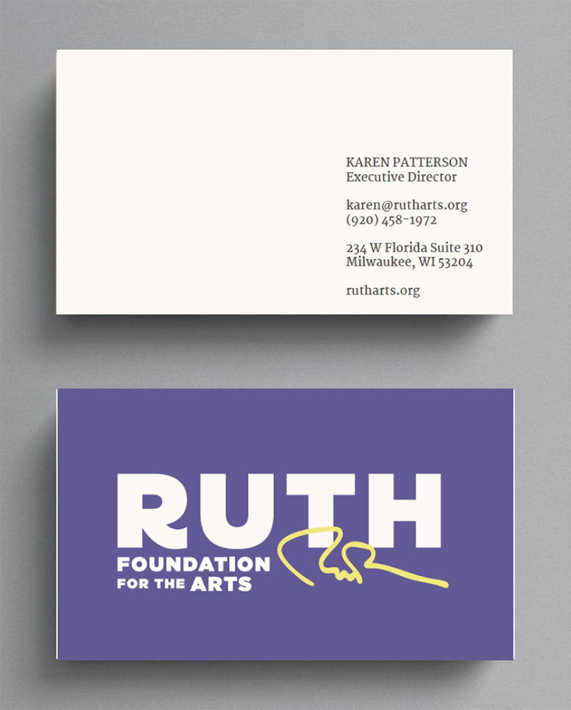
“The identity had to reflect a space that allowed both sides of everything – two parts working together, however much they may seem in tension.
Embracing the chaotic mindset of the artist, it’s equal beauty and creative nature. By allowing this tension to be part of the whole brand experience embraced the core of Ruth, speak to doing things differently (like hiring practitioners not professionals from the industry) and holding a national presence and activating hyper locally.
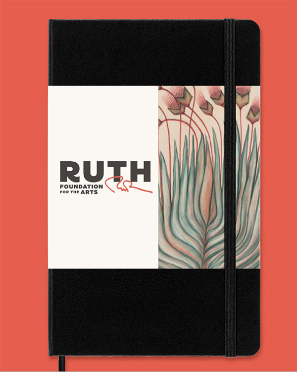
We even incorporated her beloved handwriting and doodles that were very much part of her way of working.”
Lauren Jones, Brand by Boudica
THE STRATEGY:
The Original Paradox
This is the key differentiator that sets apart The Ruth Foundation of the Arts. It’s a space that acknowledges the complexities of art-making, the many forms it comes in and creative community building. Both clear and complex, grounded and unexpected, chaotic and exacting, individual and collective.
With this paradox in mind, we crafted a brand identity and experience that embraced the ‘Artists Way’, represented the legacy of Ruth, and supported the foundation’s growth moving forward.
The NAME:
A Vision Bigger than Ruth
Updating the name from the original RDK Foundation was a big step for the foundation. We knew that Ruth wanted the foundation to live for a vision that was bigger than her.
So while we wanted a name that honoured her stewardship and generosity, it had to represent the philosophy of what the foundation was fighting for. And thus ‘The Ruth Foundation of the Arts’ was born – personal, broad yet accessible and spoke directly to whom they served.
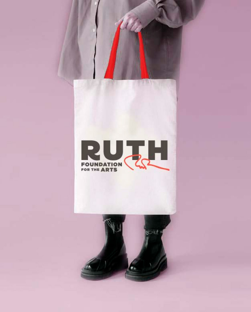

THE IDENTITY:
Building Around The Artists’ Philosophy
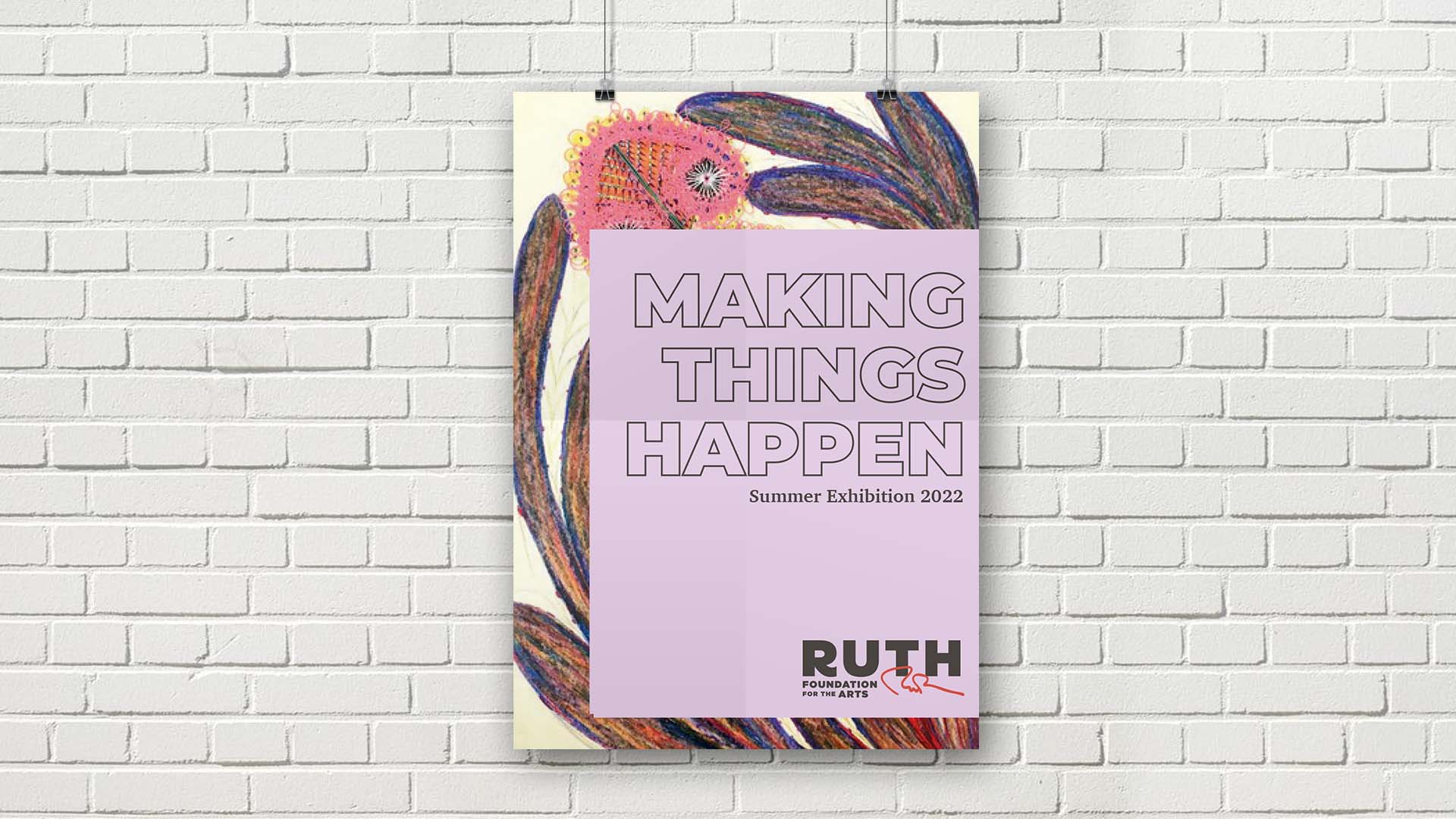
Knowing that the team valued intentionality and professionalism AND the artists way, we built a flexible and creative style that allowed for the unexpected, but remained consistent and purposeful.
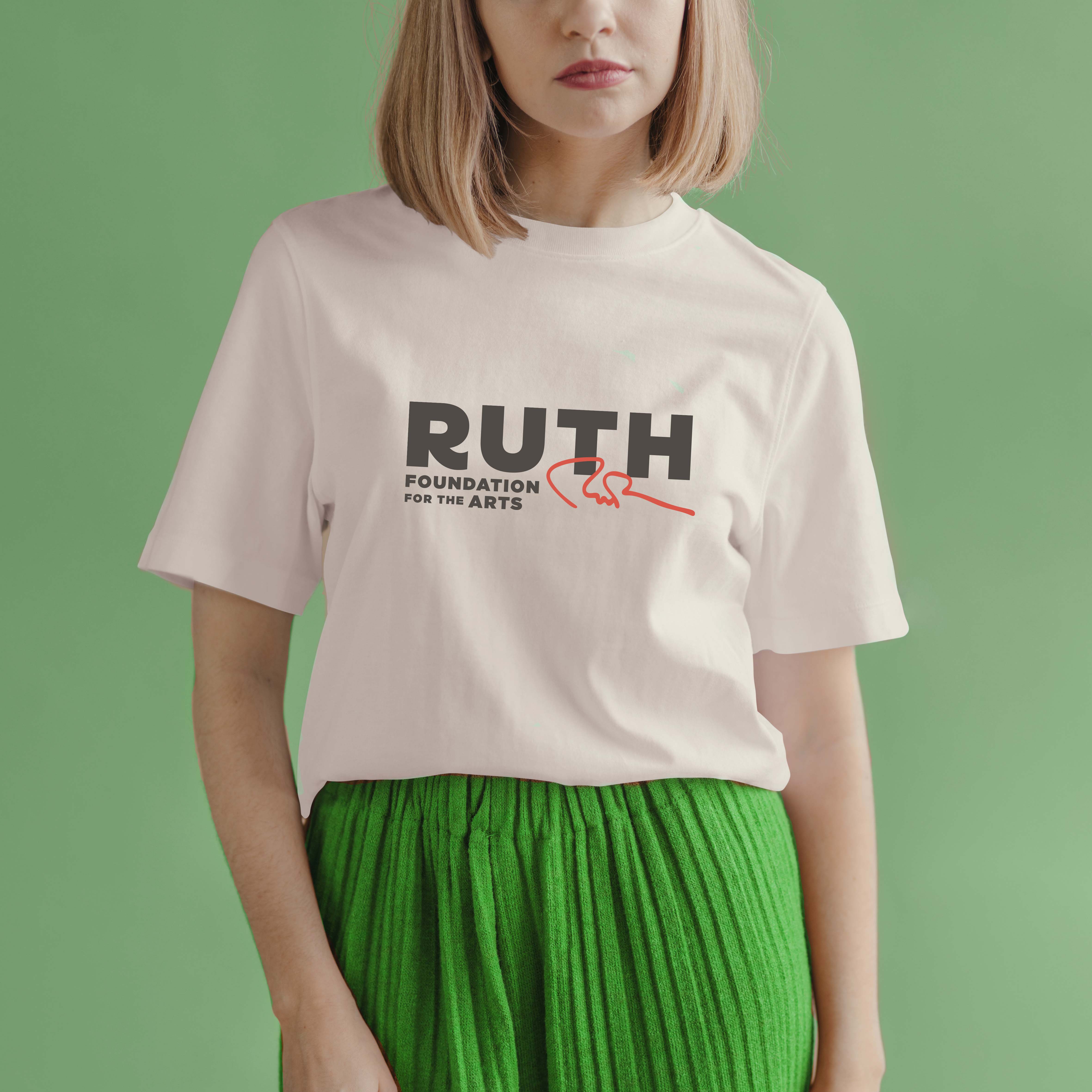
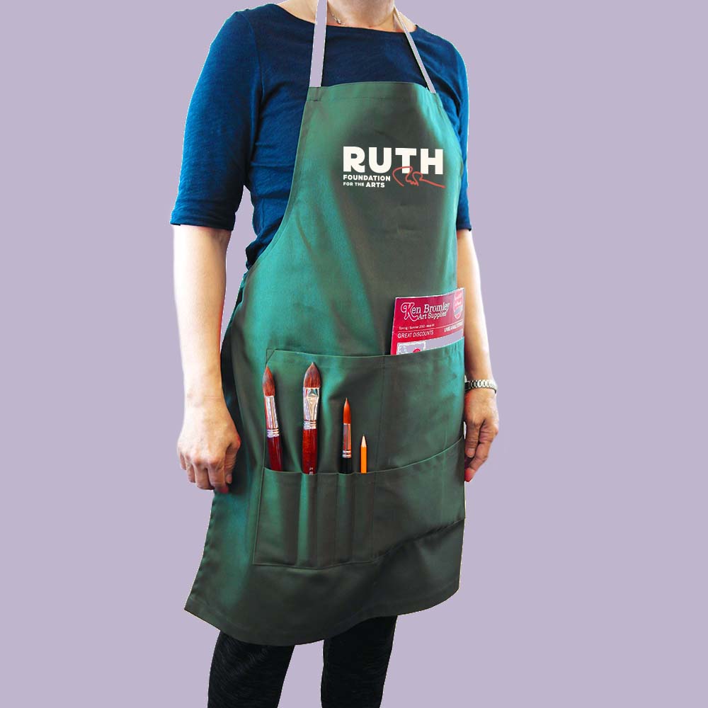
Even though there’s a lot of movement in the design, every element is chosen with intent— like Ruth’s red signature that was embedded into the logo to represent her red pen (for all those edits!) and her love for handwriting.
“Working with Lauren has been far more than I could have hoped for.”
Karen Patterson, Executive Director.
The impact:
A Brand That’s Truthful to Its Vision
The collaboration allowed the team to launch The Ruth Foundation of the Arts. They had the solid foundations that unpacked and captured the heart of the foundation, the tools to consistently tell their vision to the world, to show up at a national level with prominence and credibility, and continue to bring impact to the local communities and artists.
There’s clarity in what they want to be as a foundation and how to honour Ruth’s legacy. We stayed truthful to the vision and built a brand that is both a story of its origins AND set for future growth and change—the kind of paradox that makes the foundation what it is to begin with.
