Connecting people with innovations.
SMARTY SOCIAL
WHAT WE DID TOGETHER
Brand strategy
Brand voice
Messaging and copywriting
Brand identity and design guidelines
Brand guidelines
Brand application and materials
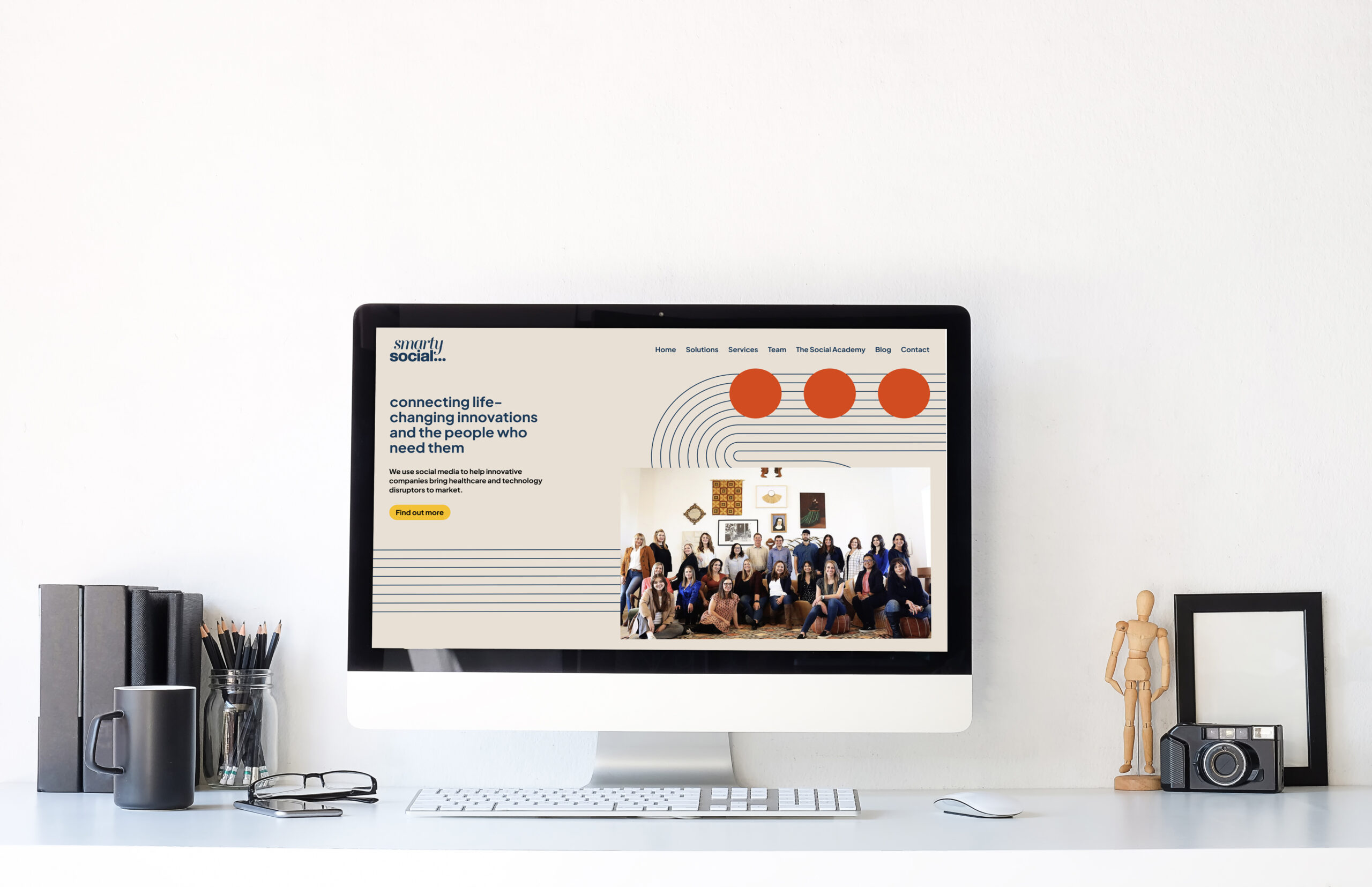
Website design
Smarty Social is a social media agency like no other. This culture-driven organisation has carved out a beautiful niche in the health innovation space – focusing on how life improving devices and concepts are brought to their audiences.
Celebrating its 10th year in business, founder Jami Eidsvold wanted to reshape the brand for the next 10 – pulling together the experiences and learnings, the skills and culture, and opportunities and client base into a futureproof brand that truly reflected her vision.
This brand partnership was a delight – putting the leadership team’s heads together to articulate and align the brand vision, creative and positioning [LIKE, SHARE, COMMENT]

THE CHALLENGE:
Reframing AND honouring the brand.
Culture is a huge part of this organisation. You need only spend a little time with Jami to witness her generous, open and unique leadership style. This really sits at the heart of the business and something the whole team gets behind – known as the Smarty Way.
This had worked so well, and it was down to us to uncover that secret sauce, to articulate and make sense of what made Smarty special, in order for it to sustain the next 10 years. The values were so deeply ingrained – it was clear to us from the start that their identity was not truly reflective of these qualities and principles.
This was the main challenge – honouring what had worked for the past 10 years, combined with a compelling vision for their next chapter – and creating something uniquely theirs. The identity and voice needed to strategically align with their position they had worked so hard to create (and it wasn’t what you’d expect from a social agency in the health innovation space that’s for sure!)

The Research:
Holding up a mirror
To understand the business, we interviewed a number of leadership and team members, viewed many testimonials from clients and poured over many notebooks. The alignment was crystal clear from the very beginning.
And this was the common theme we found throughout the discovery phase – all the elements were there, working and working well together – we had to connect the dots and piece it together in a new way.

“This is certainly one of the tightest brand foundations we have come across with before, and so it was so refreshing! Our role really came down to listening to what’s already happening, unpack the goals and leadership vision and hold up a mirror to what that strategy could look and sound like. Having known Jami and the team for a while, this made this process a lot easier and fun, that’s for sure!”
Lauren Jones, Brand by Boudica
THE STRATEGY:
Connecting the dots
There was a core strength in the organisation that kept coming up – and that was collaboration, that connection the team felt and how they worked. This passed onto how they worked with their clients. This passed on to how their clients engaged with their customers. Connection sat at the core of everything. And so we wanted an identity that could illustrate this concept in a fresh way – not just an evolution of their current branding but a truer representation of their culture at Smarty.
This led to developing the core brand pillars, tightening their beloved values, the creative brief and making sense of their offers: The 3 dots, representing the social iconography for conversation on devices, became the 3 core pillars, 3 value sets, 3 offers and the invitation to connect.
The OFFERS:
Bringing data to the forefront
One thing we uncovered was how aspect of their work was data-driven, so much so that a sub-set of offerings had emerged that sat across every project and client work. We decided to bring this front and centre – to work as a differentiator and confidence/trust booster for their work. Always placed first – it’s the first port of call for campaigns, strategies and problem solving, and now sits pride of place in their offers: Smarty Intel.


THE IDENTITY:
Innovation meets social meets California
The existing branding really was loved by the team – vibrant, retro, fun and a bit quirky. It was overdue for an elevated look to reflect the enormity of the impact this business had achieved, the team it had built and the incredible leadership that was driving this now established brand.
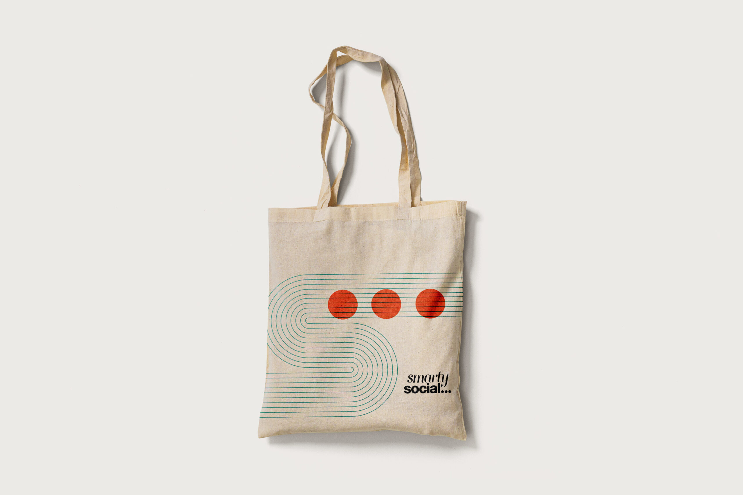
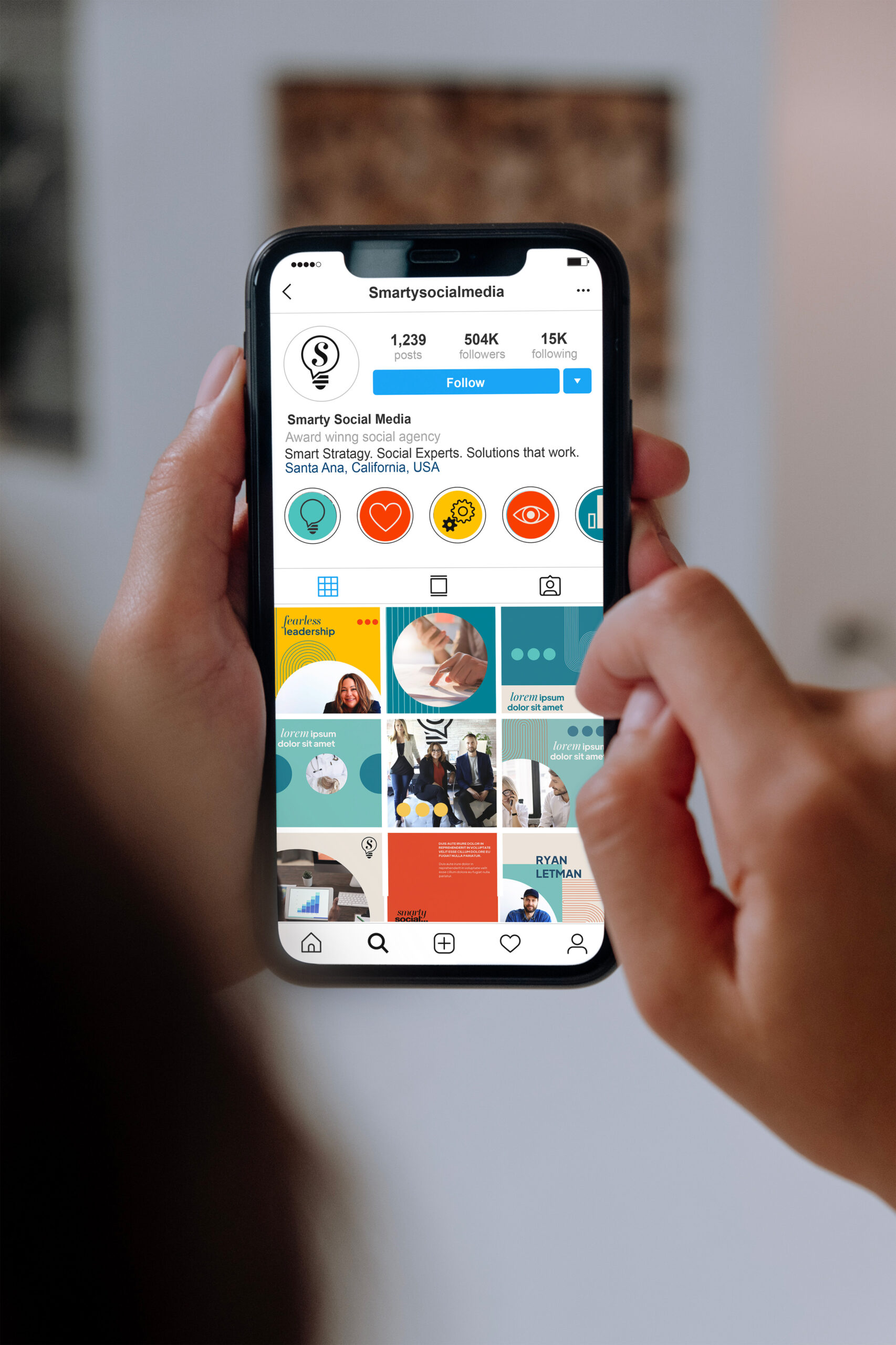
We took the existing palette and gave it a mature overhaul, grounding in a palette of off whites, with injections of burnt orange, teals, sunshine yellow, black and smart navy. We used the simple mechanism of the circle as a device to hold imagery, text and icons – offering huge flexibility and simplicity. The track marks added some smart texture and movement, perfect for motion graphics, that told the story of connecting the dots.
The overall identity reflects that delicate balance of innovation, tech and health clients with the vibrant work in social media, community as well as the Californian team. Just the right balance of all those things!
The voice work was a great exercise in strategic copywriting – linking the values to tone of voice to actions and key messaging – giving them a consistent and on brand communication style they can now truly own as a business.
The impact:
A brand for the future…
Working with established brands is always so interesting – what darlings do you have to kill, what is validated through the work and where are the gaps that need filling. Working with a brand like Smarty was so interesting as it was all there – everything that the brand needed and wanted to be. We teased it out and brought it to life for them – strategically aligning to everything that had worked and with the clarity of where it was going.
Knowing HOW the brand was put together has given the team a new lease of life to activate – on social, in presentations, engaging with clients and in a new office space. Keeping culture alive in an organisation can be hard and this brand work has helped validate and cement a lot of hard work – we can all take a leaf from Jami’s leadership book!
