


ELEVATE CITIES
Transforming the world.
One elevated city at a time.
Transforming the world. One elevated city at a time.
WHAT WE DID TOGETHER
Brand strategy and architecture
Brand guidelines
Brand identity and sub-brands
Brand application and materials
Brand voice
Website design and build
Messaging and copywriting
Social media assets
Events and collateral
Brand consultancy
This new organisation is the national and global expansion of The Elevate Prize Foundation. It activates local communities in cities by shining a spotlight on the neighbours, dreamers, and doers who make our hometowns stronger — sparking joy, belonging, and civic pride that ripple far beyond one night or one city.
They do this by inspiring, connecting, celebrating and activating local policy makers, institutions, creatives, thought leaders, community leaders, social impact enterprises and cultural influencers through convenings, awards, competitions, and community initiatives.
It’s scalable, transferable and hyper-local – and it’s magnetic!
Together with the Founder, Joe Deitch, and the CEO, Kim Coupounas, we built an entirely new, scalable and exciting organisation identity, whilst honouring the heart of The Elevate Prize Foundation. A combination of brand architecture, strategy and identity design was brought together to launch this visionary organisation.


THE CHALLENGE
New, scalable initiative of an established brand
The Elevate Prize Foundation, now in its’ 5 year, has built an internationally recognised brand in the world of foundations and social impact leaders, known for its vibrant and powerful storytelling and support for international social impact leaders. Our challenge was to create a brand for this new initiative that was reflective of the existing brand, whilst being able to stand alone and generate its own momentum. The identity itself also had to be grounded in the global brand, whilst being flexible and adaptable for localised activation. Elevate Cities’ positioning and model created new opportunities for audience appeal, new conversations and collaborations for the foundation. The brand had to reflect this broadening of appeal and capture the story for those audiences in a new way. At the very heart of this brand was long-term impact, at scale – inspiring, connecting, celebrating and activating hometown changemakers, one city at a time. This is a BIG vision. An exciting vision. And it needed a brand bold enough to hold it.

THE STRATEGY
Where needs, wants, and sustainable impact meet
Elevate Cities has long been an idea and dream for Joe Deitch, Founder of The Elevate Prize Foundation, and the timeliness of the launch couldn’t have been more appropriate. Standing for inspiration, connection, celebration and action, Elevate Cities stands for a movement that people are craving; based on hope, convening in community and the amplification of good. The potential for spreading good, from a hyper-local level, is vast. As a result, the strategy was to create a vibrant, joyful brand that evokes those emotions, demands attention and raises a smile – a movement people want to be part of.


THE STORY
Every city has a soul. We help lift it.
Both the beauty and challenge of this brand, and any new venture, is the unknown of the ‘how’: the vision is bold, clear, compelling. The ‘how’ has a plethora of solutions and is highly dependent on the people of the city, partners onboarded and opportunities they bring. The story had to lean into the bold vision and ‘why’ over the ‘how’, which also empowers each city to make it its own and put its stamp on it. Having the confidence to stand by the purpose and vision, whilst not prescribing the ways in which they can be part of the mission, is bold in itself. Instead, the language is invitational, open and deeply connected to the core beliefs: Inspiration Drives Action, Unleash Civic Energy, Build Belonging, Power Change Through Pride. Our goal was to keep the power of vision and core beliefs as the main story, whilst making strong calls to action to be a part of it. In doing so, create a brand that is clear and compelling whilst honouring hometown changemakers that love and know their city better than anyone.


THE IDENTITY
Global impact, local heart
From the beginning, we wanted the Elevate Cities brand to be vibrant, joyful and inspiring – demanding attention from potential partners and changemakers. It also needed to be highly ownable from city to city – having enough assets in the tool kit that can change and result in a unique look and feel for each location. The logomark is dynamic and a direct reference to The Elevate Prize, with a reversed C cut-out that indicates movement and momentum. The cut-out negative is also used as a mechanism to indicate community, wholeness and inclusivity. The imagery is joyful, diverse and depicts community changemakers. The palette drew inspiration from confetti – bold acid yellow, warm cherry, striking magenta, grounded emerald, all offset on a crisp, monochrome backdrop of black and white. The fonts are wide, curved and bold, paired with a friendly, clean sans serif for clarity. The customisable elements of these three – palette, font and imagery – allow for a unique, local identity to be created.
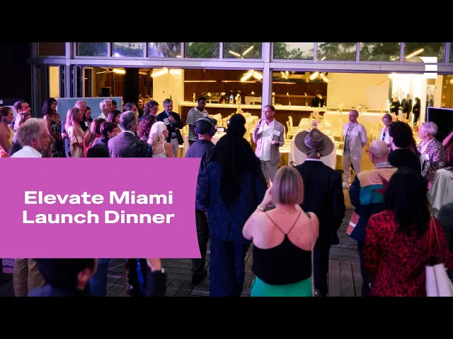
THE IMPACT
Azucar! Elevate Miami launches!
Elevate Cities was launched in the most spectacular way – with Elevate Miami. It gave the first opportunity to demonstrate the identity flexibility; the colour palette was inspired by the art deco buildings of the iconic Ocean Drive, the type was clean-lined with a nod to the architecture of the city, the imagery captured the diverse communities found in this unique, alive city. It also gave the first opportunities to connect with local partners and co-develop programmes for the city – #findthegood (a social media play on find funding dotted around the city); Sonnet Boom (a poetry competition); Elevate Miami Award (developed with Miami Foundation and showcased at Give Day Miami); and many more coming this year. Since the launch of Elevate Cities, three further cities have been slated for launch in the next 12 months. Hold onto your hats…


“The brand has been absolutely magnetic. It has opened doors, it’s attracted partners, and it’s truly created an energy that people want to be a part of.
Boudica's work doesn’t just look good, but it creates momentum. It creates alignment and real-world impact. They didn’t just design for us, they became part of our story.”
Kim Coupounas
Chief Executive Officer, Elevate Cities